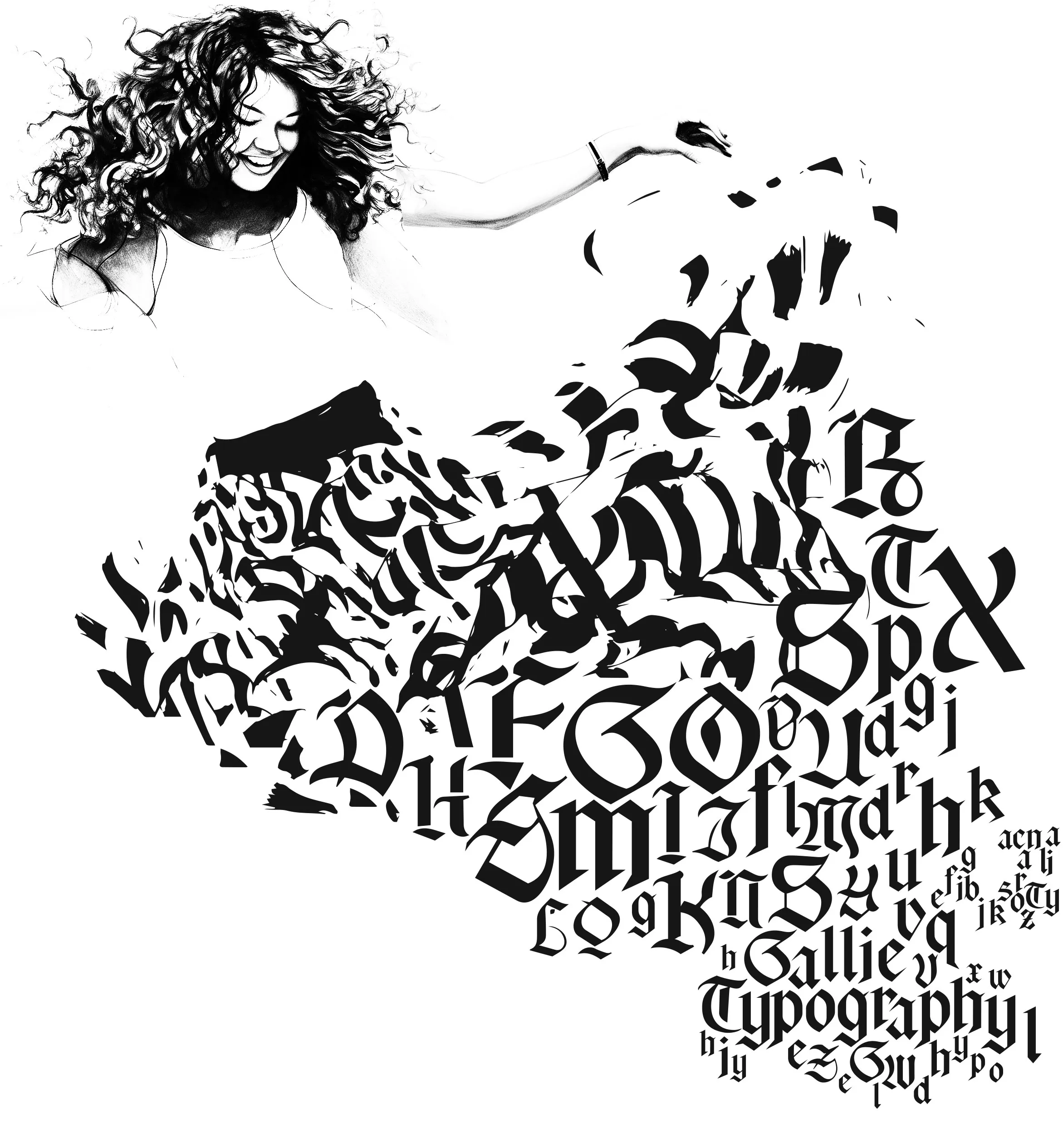
Typography stands as the cornerstone of visual communication, seamlessly blending art and science to render written language both legible and visually engaging. Delving into the anatomy of typography is akin to unraveling a language within a language, a skill that empowers designers, writers, and artists to convey messages with precision and style.
At its core, typography is a fusion of form and function. Here, the arrangement of letters, numbers, and symbols carries equal weight to the words themselves. It's a discipline where every curve, stroke, and spacing choice plays a pivotal role in crafting an effective visual message.
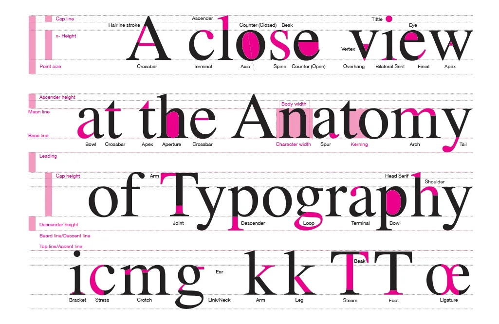
Embarking on this typographic journey necessitates familiarity with the fundamental elements that shape its anatomy. From ascenders that reach skyward to descenders that dip below the baseline, each part of a character carries its own significance. The stem, the bowl, and the counter are not mere technicalities; they form the foundational structure of a font's personality.
Serifs, the small embellishments at the tips of letter strokes, imbue a typeface with distinct character - be it the timeless elegance of Times New Roman or the sleek modernity of Arial. Conversely, sans-serif fonts exude a clean, minimalist aesthetic that communicates efficiency and contemporary design.
Understanding x-height, which measures lowercase letters excluding ascenders and descenders, is essential for establishing visual rhythm and balance in a piece of text. Kerning, the meticulous adjustment of character spacing, is akin to orchestrating a harmonious dance between letters, ensuring a seamless flow that captivates the eye.
Join me in this exploration of typography's anatomy, where I invite you to peer into the intricacies that underlie the written word. From graceful ascenders to sturdy stems, each element carries a story, a purpose, and a unique contribution to the visual language we encounter daily.
Together, let's uncover the artistry within the alphabet and discover how this mastery of form and function breathes life into your designs, transforming your messages into not only readable, but visually captivating creations. Let's embark on a journey to unravel the mysteries of typography's anatomy and harness the profound influence it wields in shaping the narratives that surround us.
Aperture: Refers to the partially enclosed, somewhat rounded negative space in certain letters, particularly in a typeface. It is the opening partially enclosed by a letterform, and it typically occurs in characters like "C," "G," "S," and "a".
Apex: An "apex" refers to the pointed or highest part of a character. It is typically associated with certain uppercase letters, such as "A" or "V," where the apex is the peak or topmost point of the letterform. The design of the apex can vary, ranging from a sharp point to a more rounded or flattened shape, depending on the style of the typeface.
Arch: An "arch" refers to a curved, typically upward, stroke or structure within a letterform. This curved element can be found in various letters, adding a distinctive visual characteristic to the design. The presence and style of arches contribute to the overall aesthetics and personality of a typeface.
Arm: An "arm" typically refers to a horizontal or upward-angled stroke that extends from a vertical stroke in a letterform. Arms are often associated with specific letters like "E," "F," "T," and "L." The design and length of the arms contribute to the overall appearance and style of the letter.
Ascender: Ascenders are the parts of certain lowercase letters that extend above the x-height, like the stems in "b" or "d". They help in distinguishing different characters and contribute to the overall visual balance of a typeface.
Axis: The axis is the imaginary line through the center of a letterform, indicating the primary stroke direction or stress. It plays a crucial role in defining the overall style and appearance of a typeface. The axis can be vertical, diagonal, or slanted, impacting the formality, dynamism, and readability of the letterforms.
Baseline: The baseline is an imaginary line upon which the letters in a font rest. It serves as a reference point for positioning characters. All characters are aligned along this line, and it provides a stable foundation for text.
Beak: A "beak" usually refers to a decorative or pointed terminal at the end of a stroke in a letterform. Beaks are often found in calligraphy, lettering, or certain typefaces, adding an ornamental flourish. They can appear on letters like "a," "c," "r" or "s," enhancing the visual appeal of the characters.
Bilateral Serif: A "bilateral serif" refers to a type of serif that appears on both sides of a letterform's stroke. Serifs are the small, finishing strokes or lines that are added to the ends of the main strokes of a letter. In the case of bilateral serifs, these are symmetrical and appear on both the top and bottom (or left and right, depending on the orientation) of the stroke.
Bowl: The bowl is the rounded, enclosed part of certain lowercase letters like "d", "b", or "o". Understanding the bowl's shape and size is crucial for recognizing and designing letterforms.
Bracket: Refers to the curved or angled connection between the stem and serif of a letterform. It's a transitional element that helps smoothly connect the vertical or diagonal strokes of a character to its serif.
Cap Height: This refers to the height of a capital letter from the baseline to the top of the letter. Understanding cap height is crucial for maintaining consistent letter proportions and achieving a balanced visual appearance.
Counter: The counter is the partially or fully enclosed space within letters like "o", "e", or "a". It's important for recognizing and distinguishing characters, especially in more complex typefaces.
Crossbar: The "crossbar" is a horizontal stroke that intersects or connects two vertical strokes in a letterform. It is a distinctive feature found in certain uppercase and lowercase letters, such as "A," "H," "E," and "t." The placement, length, and thickness of the crossbar can vary depending on the design of the typeface.
Crotch: The term "crotch" is often used to describe the point where two strokes or lines meet at an angle. This term is most commonly associated with the juncture where the main vertical and diagonal strokes intersect in certain letters, especially those with diagonal elements like "V" or "W."
Descender: Descenders are parts of certain lowercase letters that extend below the baseline, like the tails in "g" or "y". They add visual interest and help differentiate characters, contributing to legibility.
Ear: Typically refers to the small, often decorative, extension or flourish that projects from the upper part of the lowercase letter "g." It is the part of the letter that extends above the x-height and can take various forms, adding a distinctive element to the design of the letter "g."
Eye: This term refers to the enclosed counter or the interior space within a letter, typically found in letters like "e," "g," and "a." The design of the eye can vary significantly between typefaces and contributes to the overall appearance and legibility of the letterforms.
Finial: Is a decorative or tapering element found at the end of a stroke in a letterform. It adds an ornamental touch and varies in form, contributing to the visual style of a typeface.
Foot: The term "foot" typically refers to the bottom, usually horizontal, stroke of a lowercase letter that extends below the baseline. Letters such as "e," "a," "g," and "y" often have a foot. The design of the foot can vary among different typefaces and contributes to the overall appearance and style of the letterforms.
Leading: Leading is the space between lines of text, measured from baseline to baseline. Proper leading ensures that lines are spaced optimally for comfortable reading.
Leg: The term "leg" is commonly used to refer to the downward-extending, usually vertical stroke of certain lowercase letters. This is particularly relevant in letters such as "h," "m," "n," and "u." The leg is the part that extends below the baseline.
Ligature: Is a typographic character that combines two or more letters into a single, unified glyph. Ligatures are often designed to improve the appearance of specific letter combinations and enhance overall readability. They are commonly used to address visual collisions or awkward spacing between certain letter pairs.
Loop: The term "loop" is often used to describe a curved or circular portion of a letterform. Letters that commonly feature loops include "e," "g," "b," and "d." The loop is the rounded or enclosed element within these letters.
Joint: A "joint" typically refers to the point where two strokes meet in a letterform. Joints can occur in various parts of a letter, such as the connection between the stem and arm, the intersection of two diagonal strokes, or the meeting point of a curve and a straight line. The design of joints influences the overall appearance, flow, and style of the letterforms in a typeface.
Kerning: Kerning involves adjusting the spacing between individual characters to achieve a visually pleasing result. It helps improve the overall harmony and readability of a text.
Neck/Link: The term generally refers to the narrow, vertical portion of a lowercase letter that connects the curved or round part (like the bowl) to the horizontal part (such as the baseline or a crossbar). The neck is often found in letters like "h," "m," "n," and "u."
Overhang: An "overhang" refers to the part of a character that extends beyond its usual width, often seen in letters like "f," "j," "y," and "p." Overhangs contribute to the visual balance and style of a typeface.
Sans-serif: A sans-serif typeface lacks serifs. Examples include "Arial" and "Helvetica". Sans-serif fonts often convey a modern and clean aesthetic.
Serif: Serifs are small lines or feet at the ends of the strokes on a letter. They can be short (as in "Times New Roman") or long (as in "Garamond"). Serifs contribute to the overall style and readability of a typeface.
Shoulder: The term "shoulder" is often used to describe the curved, often horizontal stroke that connects the stem to the curved portion of certain letters. This is particularly relevant in letters like "n," "h," "m," and "r."
Spine: The "spine" typically refers to the main curved stroke in the letter "S." It's a crucial element that varies between typefaces, influencing their overall appearance. In a broader sense, "spine" can also describe the central stroke in letters like "n" or "h".
Stem: The stem is the main vertical stroke of a letter. For example, in the letters "l" or "t", the main upright line is considered the stem. It's one of the fundamental structural elements of a letterform.
Spur: A "spur" refers to a small, projecting feature, often a small, tapered projection or serif, that extends from the main stroke of a letterform. Spurs are commonly found in certain typefaces, particularly in letters like "G" or "a".
Stress: This term refers to the angle or direction of the main strokes in a typeface. It indicates the overall slant or tilt of the characters and plays a significant role in defining the style and appearance of a typeface. There are two primary types of stress: vertical stress and diagonal stress.
Tail: Refers to the descending stroke or the part of a letterform that extends below the baseline. Letters with tails include characters like "g," "j," "p," "q" and "y." The tail is the portion that gives these letters their distinctive shape and extends below the main body of the letter.
Terminal: In typography, a "terminal" is the end of a stroke in a letterform, like a serif or a finial. It adds style and personality to a typeface, affecting its overall appearance and feel.
Tittle: A "tittle" refers to the dot or small mark that appears above lowercase letters like "i" and "j." It's a tiny, often overlooked detail in typography, but it plays a crucial role in distinguishing these letters from others in a typeface. The tittle is also present in some diacritical marks, like the dot above the letters "ä," "ë," "ï," "ö," "ü," and "ÿ".
Tracking: Refers to the overall spacing between characters in a block of text. It's used to adjust the density and appearance of the text, making it more readable and aesthetically pleasing.
Vertex: A "vertex" generally refers to the point where two strokes meet in a letterform. It's a term more commonly associated with calligraphy and lettering. The design of vertices can vary, ranging from sharp points to rounded intersections, and it contributes to the overall aesthetic and style of a typeface.
X-height: Refers to the height of the lowercase letters, excluding ascenders and descenders. A larger x-height can contribute to better legibility, especially in small font sizes.
Understanding these terms is crucial for working with typography effectively, whether you're designing a document, website, or any other form of visual communication. It allows us to make informed decisions about font selection, spacing, and overall design.